Part 17 Lab 2: Global plastic waste
Plastic pollution is a major and growing problem, negatively affecting oceans and wildlife health. Our World in Data has a lot of great data at various levels including globally, per country, and over time. For this lab we focus on data from 2010.
Additionally, National Geographic ran a data visualization communication contest on plastic waste as seen here.
17.1 Learning goals
- Visualizing numerical and categorical data and interpreting visualizations
- Recreating visualizations
- Getting more practice using with R, RStudio, Git, and GitHub
17.2 Getting started
Download this RMarkdown template for the lab. Save it to your class GitHub repo with a name like
lab-02-plastic-waste.Rmd. In future labs, you will make your own RMarkdown documents from scratch.Download this dataset and save it to your class GitHub repo in a folder called
data.
17.2.1 Packages
We’ll use the tidyverse package for this analysis.
Add code to load the tidyverse package to the setup chunk at the top of the document.
17.2.2 Data
The following code will read in the data you saved to your repo. Add this to your document.
plastic_waste <- read_csv(here::here("data", "plastic-waste.csv"))You can view this dataset using the dplyr::glimpse(), head(), and View().
Try these out in the Console.
The variable descriptions are as follows:
code: 3 Letter country codeentity: Country namecontinent: Continent nameyear: Yeargdp_per_cap: GDP per capita constant 2011 international $, rateplastic_waste_per_cap: Amount of plastic waste per capita in kg/daymismanaged_plastic_waste_per_cap: Amount of mismanaged plastic waste per capita in kg/daymismanaged_plastic_waste: Tonnes of mismanaged plastic wastecoastal_pop: Number of individuals living on/near coasttotal_pop: Total population according to Gapminder
17.3 Warm up
Notice that some cells in the data have the value NA — what does this mean?
17.4 Exercises
Let’s start by taking a look at the distribution of plastic waste per capita in 2010.
ggplot(data = plastic_waste) +
  aes(x = plastic_waste_per_cap) +
  geom_histogram(binwidth = 0.2)
#> Warning: Removed 51 rows containing non-finite values (stat_bin).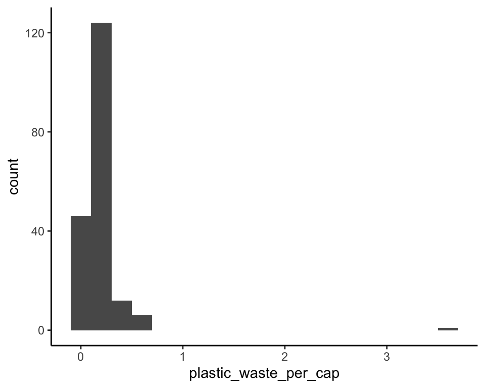
One country stands out as an unusual observation at the top of the distribution. One way of identifying this country is to filter the data for countries where plastic waste per capita is greater than 3.5 kg/person.
We will cover this function next week. For now, what do you think this code does?
plastic_waste |>
  filter(plastic_waste_per_cap > 3.5)
#> # A tibble: 1 × 10
#>   code  entity   continent   year gdp_per_cap plastic_waste_p… mismanaged_plast…
#>   <chr> <chr>    <chr>      <dbl>       <dbl>            <dbl>             <dbl>
#> 1 TTO   Trinida… North Ame…  2010      31261.              3.6              0.19
#> # … with 3 more variables: mismanaged_plastic_waste <dbl>, coastal_pop <dbl>,
#> #   total_pop <dbl>
Did you expect this result? You might consider doing some research on Trinidad and Tobago to see why plastic waste per capita is so high there, or whether this is a data error.
17.4.1 Exercise 1
- Plot, using histograms, the distribution of plastic waste per capita faceted by continent. What can you say about how the continents compare to each other in terms of their plastic waste per capita?
NOTE: From this point onwards, the plots and the output of the code are not displayed in the lab instructions, but you can and should the code and view the results yourself.
Another way of visualizing numerical data is using density plots. Adapt your code above to use density plots instead of histograms.
The y-axes for histograms and densities differ by default. Histograms have the raw counts. Densities have the density (think of it like proportion). If you want to put density plots and histograms on the same plot, we need to tell them to have the same y-axis.
Plot histograms and densities on the same plot. In the geom_density() function,
add aes(y = after_stat(count)) to tell it to put counts, not densities on the y-axis.
- Make just a density plot of plastic waste by continent Coloring the density curves by continent.
The resulting plot may be a little difficult to read, so let’s also fill the curves in with colors as well.
Make the fill color somewhat transparent to make the overlapping distributions easier to see. You may need to try several different transparency levels to find one that looks niece.
- Describe why we defined the
colorandfillof the curves by mapping aesthetics withaes()but defined thealphalevel directly in the geom.
🧶 ✅ ⬆️ Now is a good time to knit your document and commit and push your changes to GitHub with an appropriate commit message. Make sure to commit and push all changed files so that your Git pane is cleared up afterwards.
17.4.2 Exercise 2
Yet another way to visualize differences in plastic waste distributions across continents is box plots.
Make a plot with continent on the x-axis, plastic waste on the-axis, and fill of the box plots by continent.
Adjust this plot so that it also shows individual data points.
Add a density curve for each continent as well (i.e., make a “raincloud plot”).
What does the density or data points show that the boxplot does not?
17.4.3 Exercise 3
Visualize the relationship between plastic waste per capita and mismanaged plastic waste per capita using a scatterplot. Describe the relationship.
Color the points in the scatterplot by continent. Does there seem to be any clear distinctions between continents with respect to how plastic waste per capita and mismanaged plastic waste per capita are associated?
Visualize the relationship between plastic waste per capita and total population; and between plastic waste per capita and coastal population. You will need to make two separate plots. Do either of these pairs of variables appear to be more strongly associated? Add trend lines (either loess smooths or linear trends) to these plots.
🧶 ✅ ⬆️ Now is another good time to knit your document and commit and push your changes to GitHub with an appropriate commit message. Make sure to commit and push all changed files so that your Git pane is cleared up afterwards.
17.4.4 Bonus
Recreate the following plot, and interpret what you see in context of the data.
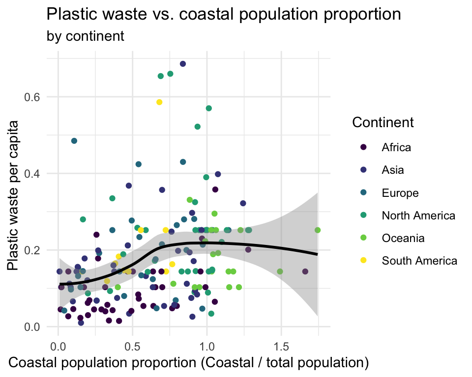
Hint: The x-axis is a calculated variable. One country with plastic waste per capita over 3 kg/day has been filtered out. And the data are not only represented with points on the plot but also a smooth curve. The term “smooth” should help you pick which geom to use.
17.5 Finishing Up
🧶 ✅ ⬆️ Knit, commit, and push your changes to GitHub with an appropriate commit message. Make sure to commit and push all changed files so that your Git pane is cleared up afterwards and review the md document on GitHub to make sure you’re happy with the final state of your work.
Once you’re done, check to make sure your latest changes are on GitHub.