Part 14 Working with ggplot2
First, the ggplot2 package comes with the tidyverse meta-package. You can just load tidyverse, and it will also load ggplot2.
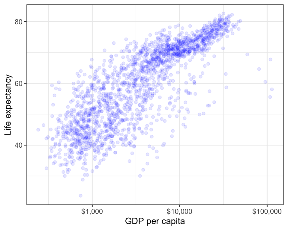
Let’s use the above scatterplot as an example to see how to use the ggplot() function.
First, we will pass one argument to ggplot() function itself:
- data: the data frame containing your plotting data
ggplot(gapminder)
After this, we add additional functions as layers to add features to the plot and control their appearance. The first thing we will add is aes(). The aes() function tells R to look in the data for variable names to map them to different aesthetic features, such as x-position, y-position, or color.
ggplot(gapminder) +
  aes(x = gdpPercap, y = lifeExp)
Next, we want to add some geometric shapes to the plot.
These use functions with the form geom_SOMETHING().
Different plot shapes (geom_SOMETHING) accept different aes() arguments.
These are listed in the help file for the geom function:
?geom_point, ?geom_line, etc.
ggplot(gapminder) +
  aes(x = gdpPercap, y = lifeExp) +
  geom_point()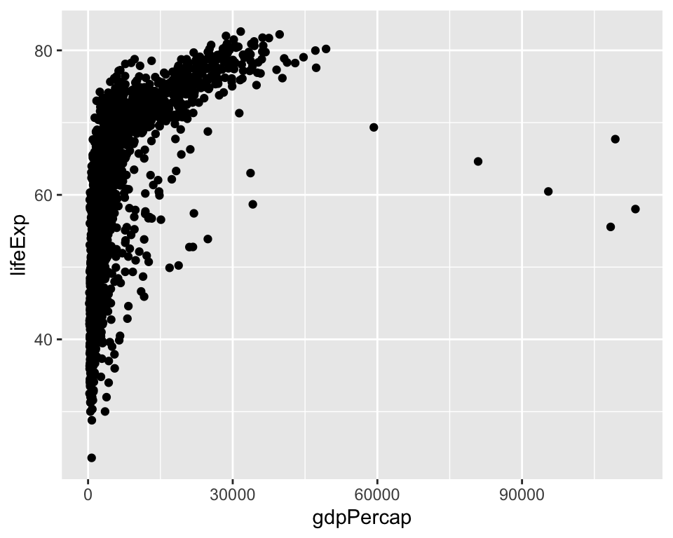
You can control aesthetics using constants or variables from outside data by specifying them outside of aes().
For example, to make all of the shapes of plot blue, you can add: color = "blue".
ggplot(gapminder) +
  aes(x = gdpPercap, y = lifeExp) +
  geom_point(color = "blue")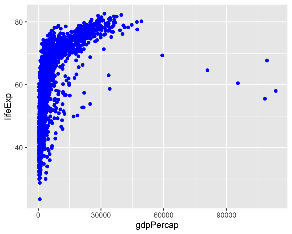
There’s a bit of overplotting (overlapping symbols), so let’s also make the points semi-transparent.
This is controlled using the alpha argument
(you need 1/alpha points overlaid to achieve a solid point).
ggplot(gapminder) +
  aes(x = gdpPercap, y = lifeExp) +
  geom_point(color = "blue", alpha = .1)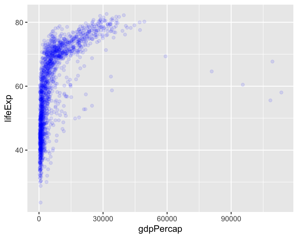
For now, that’s the only geom that we want to add.
Now, let’s specify a scale transformation, because the plot would really benefit if the x-axis is on a logarithmic
scale.
These functions take the form scale_AESTHETIC_TYPE().
As usual, you can tweak this layer, too, using this function’s arguments.
In this example, we’re re-naming the x-axis (the name argument),
transform the values (the trans argument),
and changing the labels to have a dollar format (the labels argument).
ggplot(gapminder) +
  aes(x = gdpPercap, y = lifeExp) +
  geom_point(color = "blue", alpha = .1) +
  scale_x_continuous(
    name = "GDP per capita",
    trans = "log10",
    labels = scales::dollar_format()
  )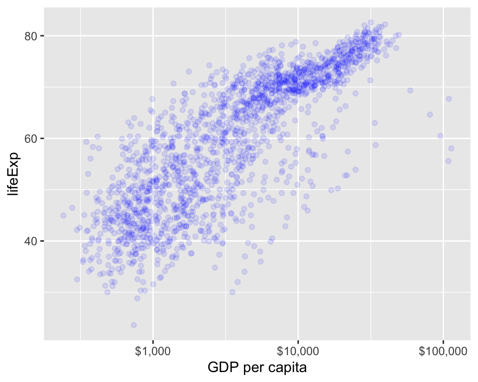
I’m tired of seeing the ugly default gray background, so I’ll add a theme()
layer.
I like theme_bw() (you can tweak themes later, too!).
Then, I’ll re-label the y-axis using the ylab() function.
Et voilà!
ggplot(gapminder) +
  aes(x = gdpPercap, y = lifeExp) +
  geom_point(color = "blue", alpha = .1) +
  scale_x_continuous(
    name = "GDP per capita",
    trans = "log10",
    labels = scales::dollar_format()
  ) +
  theme_bw() +
  ylab("Life expectancy")